Samsung's One UI 8.5 May Finally Unify Dark Mode App Icons
Samsung appears poised to address one of the most persistent visual inconsistencies in smartphone dark modes with its upcoming One UI 8.5 update. The long-standing issue of mismatched app icons that refuse to adapt to dark themes might finally see a comprehensive solution.
The Dark Mode Dilemma
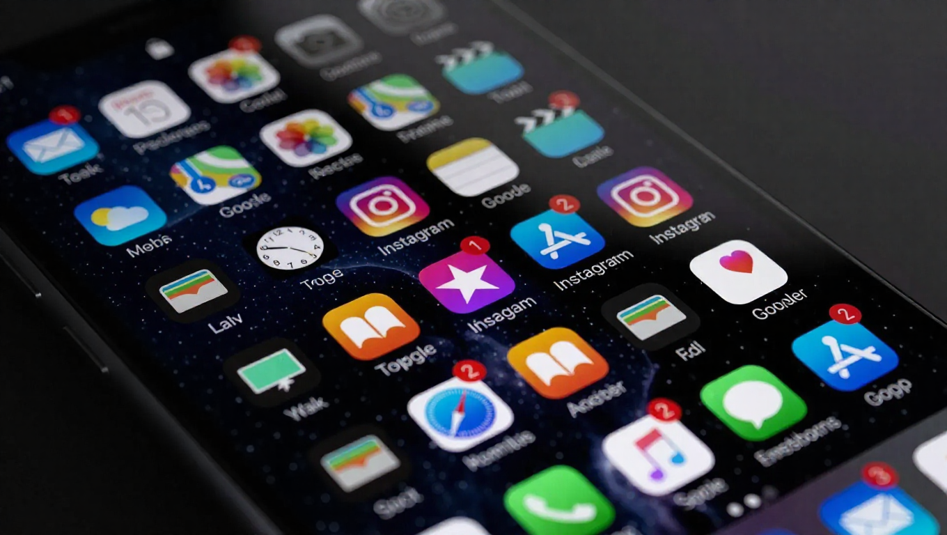
For years, smartphone users embracing dark mode have encountered a frustrating visual disconnect. While system interfaces, menus, and notifications seamlessly transition to darker themes, app icons on the home screen often remain stubbornly bright and colorful. This creates a jarring experience where dark backgrounds are punctuated by glaringly light icons, undermining the very purpose of dark mode's eye comfort and aesthetic cohesion.
The problem stems from inconsistent developer implementation and the lack of system-level enforcement. Some app developers provide dark mode-compatible icons, while others maintain their original bright designs regardless of system theme settings. This fragmentation has left users with home screens that resemble patchwork quilts rather than unified interfaces.
One UI 8.5's Potential Solution
Recent developments suggest Samsung is taking a more aggressive approach to this problem. The upcoming One UI 8.5 update may force dark-themed icons across all applications, regardless of individual developer implementation. This system-level enforcement would ensure visual consistency throughout the user interface.
Beyond simple color shifting, the update might introduce subtle 3D redesigns to app icons, incorporating drop shadows that would appear in both light and dark modes. This enhancement could provide additional depth and visual polish while maintaining the core functionality users expect from their app launchers.
Industry Alignment
This move aligns with broader industry trends toward standardized theming. Google recently implemented policy changes requiring app developers to allow for automatic icon theming, creating a foundation for more consistent visual experiences across the Android ecosystem. Samsung's implementation appears to build upon this foundation while potentially going further than current requirements.
The timing of these developments suggests a coordinated effort between platform developers and device manufacturers to eliminate visual inconsistencies that have persisted through multiple generations of smartphone software. As dark mode becomes increasingly central to the user experience, addressing these remaining pain points becomes more critical.
User Experience Implications
For everyday users, this change could significantly enhance the dark mode experience. The elimination of bright icon outliers would create truly cohesive home screens that support the intended benefits of dark mode, including reduced eye strain in low-light conditions and improved battery life on OLED displays.
The potential addition of 3D elements and drop shadows could also modernize the visual appearance of app icons without sacrificing usability. Careful implementation would maintain quick recognition while adding subtle sophistication to the overall interface design.
Conclusion
Samsung's potential move to enforce dark-themed icons represents a significant step toward visual consistency in smartphone interfaces. By addressing one of dark mode's most persistent eyesores, the company demonstrates its commitment to refining the user experience at a fundamental level. As the smartphone industry continues to mature, such attention to detail in interface design becomes increasingly important for distinguishing premium experiences from merely functional ones.
While official confirmation awaits Samsung's formal announcement, the direction suggested by recent developments points toward a more unified and visually coherent future for smartphone interfaces. For users who have long tolerated the visual chaos of mismatched dark mode icons, this change can't come soon enough.