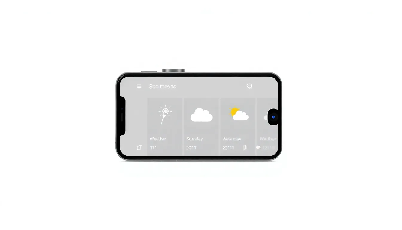
Pixel Weather App Unveils Bold New Icon Design with Enhanced Visual Clarity
Google's Pixel Weather app is receiving a significant visual overhaul with redesigned forecast icons that prioritize clarity and instant recognition. The update introduces a fresh aesthetic approach that moves away from previous design conventions toward more functional visual communication.
A Shift Toward Bold Visual Communication
The most noticeable change in the latest Pixel Weather update is the complete redesign of weather icons. The new icons abandon the color gradients that characterized previous versions in favor of bold layouts with high-contrast edges. This design shift represents a deliberate move toward iconography that communicates weather conditions more immediately and intuitively.
Effective weather icons should convey information at a glance, allowing users to quickly understand current and forecasted conditions without requiring detailed examination. The new design philosophy appears to prioritize this instant recognition, with each icon crafted to be more distinct and readable across various lighting conditions and screen types.
The visual changes extend beyond mere aesthetic updates, representing a thoughtful reconsideration of how weather information should be presented on mobile devices. By emphasizing clarity over decorative elements, the redesign aims to make weather checking a more efficient and straightforward experience for users.
Enhanced City Management Features
Alongside the visual refresh, the update introduces practical improvements to city management functionality. Users will find new controls that make reorganizing their list of saved cities significantly easier. This enhancement addresses a common user need for flexible location management, particularly for those who travel frequently or monitor weather in multiple regions.
The improved city organization tools complement the visual updates by creating a more cohesive user experience. Where the icon redesign improves information consumption, the enhanced city management features streamline information access and customization. Together, these changes represent a comprehensive approach to weather app usability.
Design Philosophy and User Experience
The icon redesign reflects ongoing developments in digital interface design, where clarity and accessibility increasingly take precedence over purely decorative elements. The high-contrast approach particularly benefits users in various lighting conditions and those with visual impairments, making weather information more universally accessible.
While weather reporting on Android continues to evolve, the Pixel Weather app maintains its position as a dedicated weather solution with this substantial update. The changes suggest a continued commitment to refining the app's core functionality while adapting to modern design standards and user expectations.
The update includes an introductory screen explaining the design changes, indicating Google's awareness that visual transitions can sometimes disorient regular users. This transparency about design decisions helps users understand the reasoning behind the changes and potentially smooths the adaptation process.
Conclusion
The Pixel Weather app's visual overhaul represents more than just a cosmetic refresh—it's a strategic move toward more functional, accessible weather information presentation. By combining bold, high-contrast icons with improved city management tools, Google has created a more intuitive and user-friendly weather experience. The changes demonstrate how thoughtful design decisions can enhance practical utility while maintaining aesthetic appeal, setting a standard for how weather information might be presented in future mobile applications. As users adapt to the new visual language, the ultimate success of these changes will be measured by how quickly and accurately they can interpret weather conditions at a glance.