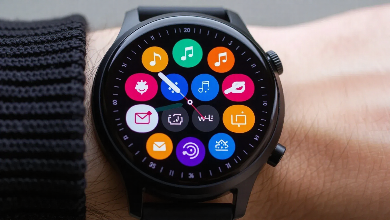
The One UI 8 Watch Update Nearly Ruined Galaxy Watches for Me
The latest One UI 8 Watch update for Samsung's Galaxy Watch series has sparked significant debate among users and reviewers. While software updates typically bring improvements, this particular release has been met with unexpected criticism for its fundamental redesign of the Tile system—a core interface element that many relied on for quick information access.
The Tile Redesign: From Full-Screen to Widget-Like
One UI 8 Watch introduces a complete overhaul of how Tiles function on Galaxy Watches. Previously, Tiles occupied the entire circular display, maximizing screen real estate with large fonts, clear progress bars, and minimal clutter. This design philosophy prioritized glanceability—the ability to quickly absorb information during activities like jogging or workouts without excessive scrolling or interaction.
The new system replaces these full-screen Tiles with oblong, widget-like components that can be stacked vertically on a single Tile screen. While this theoretically allows more information to be displayed at once, it comes at significant cost to usability. Tiles are now smaller, harder to read, and require both horizontal and vertical scrolling—a cumbersome experience on a wrist-worn device.
Design Compromises and Visual Inconsistencies
Several specific design choices have drawn particular criticism. The oblong shape of the new Tiles creates awkward visual gaps on the circular watch face, with some describing the effect as "trying to fit oblong pegs into round holes." The previous design used predominantly black backgrounds that blended with the watch bezel, creating a seamless appearance. The new Tiles feature colored backgrounds that highlight their mismatched shape against the circular display.
Size inconsistency presents another problem. Some Tiles are short while others are tall, and users cannot choose between sizes for all Tiles. For example, the Daily Activity Tile only comes in a short version, leaving half the screen empty with a prominent "Plus" button if users want it as their only Tile. This inefficient use of space contradicts smartwatch design principles that emphasize information density and quick access.
Usability Concerns in Practical Scenarios
Beyond aesthetics, the update introduces practical usability issues. The smaller Tile size means reduced font sizes and smaller interactive elements, making the watch harder to use while moving or exercising. The requirement to scroll both horizontally between Tile screens and vertically within them adds unnecessary complexity to what should be a simple, streamlined interface.
Additional frustrations include redundant naming conventions—Tile screens often share names with the Tiles themselves—and the extra steps required to customize or rename these elements. These seemingly minor inconveniences accumulate into a frustrating user experience that contradicts the smartwatch's purpose as a quick-access companion device.
Broader Implications for Smartwatch Design
This controversy highlights fundamental questions about smartwatch interface design. Should watch interfaces mimic smartphone layouts, or should they be optimized specifically for the wrist-worn form factor? The previous Tile design followed the latter approach, with circular-optimized layouts that maximized the small display. The new design appears to borrow more from smartphone widget paradigms, potentially sacrificing what made Galaxy Watches particularly usable in active scenarios.
While some users may appreciate having more information visible at once, the trade-offs in readability and ease of use appear significant. The update represents a philosophical shift in how Samsung approaches watch interfaces—one that prioritizes information quantity over glanceability and simplicity.
Conclusion: A Step Backward in User Experience
The One UI 8 Watch update demonstrates how even well-intentioned redesigns can negatively impact user experience when they compromise core usability principles. The Tile system, once a strength of Galaxy Watches for its clarity and efficiency, has become more complicated and less intuitive in this iteration. While software preferences are subjective, the widespread criticism suggests Samsung may have misjudged how users interact with their watches in real-world scenarios.
Whether Samsung will address these concerns in future updates remains to be seen. For now, users accustomed to the previous Tile system face a significant adjustment period—one that many find unnecessarily frustrating for a device designed to simplify, not complicate, daily interactions.