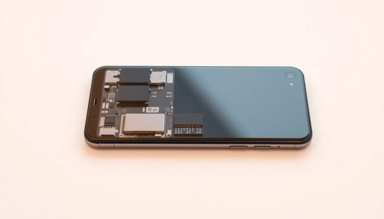
Nothing Phone (4a) Pro Hands-On: A Shift Away from Transparent Design
The Nothing Phone (4a) Pro has arrived as the latest offering from the brand known for its distinctive transparent aesthetic. While the device appears to deliver meaningful upgrades in performance and specifications, early hands-on impressions highlight a notable departure from the design language that made Nothing phones instantly recognizable.
Design Evolution or Departure?
The most striking change in the Phone (4a) Pro is its visual presentation. Previous Nothing models featured extensive transparent elements that revealed internal components and created a unique technological aesthetic. This new iteration largely abandons that approach, opting for a more conventional smartphone appearance with minimal transparent accents.
Initial examination suggests the device maintains Nothing's characteristic attention to detail in construction, with solid build quality and thoughtful ergonomics. However, the reduction of transparent elements represents a significant shift in design philosophy that may surprise longtime followers of the brand.
Performance and Features
Beyond the aesthetic changes, the Phone (4a) Pro appears to deliver on its promised technical improvements. The device features upgraded processing capabilities, enhanced display technology, and improved camera systems that position it as a competitive mid-range offering.
Early testing indicates responsive performance across common applications and tasks, with particular attention paid to user interface optimizations. The device continues Nothing's approach to software with a clean, minimal operating system experience that complements the hardware design.
Market Positioning and User Reception
The design shift raises questions about Nothing's strategic direction. While the transparent aesthetic garnered significant attention and established brand identity, it also represented a polarizing design choice. The move toward more conventional smartphone aesthetics may broaden the device's appeal to mainstream consumers who prioritize functionality over distinctive styling.
Initial reactions suggest mixed responses to the design changes. Some users appreciate the more traditional appearance, while others express disappointment at the loss of the brand's signature transparent elements that differentiated Nothing from competitors.
Conclusion: Balancing Innovation and Accessibility
The Nothing Phone (4a) Pro represents an interesting evolution for the brand, balancing performance improvements with a significant design recalibration. While the device delivers solid technical specifications and maintains Nothing's commitment to thoughtful user experience, the reduced emphasis on transparent design elements marks a clear departure from the brand's established visual identity.
This shift suggests Nothing may be prioritizing broader market appeal over maintaining its distinctive aesthetic, potentially signaling a new phase in the brand's development. The Phone (4a) Pro succeeds as a capable mid-range smartphone but may leave some enthusiasts wondering if the brand's original design philosophy has been compromised in pursuit of mainstream acceptance.