The Nothing Phone 4a Fixes the Two Biggest Problems with the Nothing Phone 3
The Nothing Phone 3, while praised for its software and camera capabilities, left many reviewers with mixed feelings due to its controversial design and the perceived limitations of its signature Glyph Matrix feature. The upcoming Nothing Phone 4a, however, seems poised to address these core criticisms directly, offering what appears to be a substantial refinement over its predecessor.
A Return to Form in Design
The design of the Nothing Phone 3 was a point of contention. While ambitious, its revamped aesthetic was not universally well-received, with some finding it a step back from the brand's earlier, more cohesive visual language. The Phone 4a, based on early information, represents a corrective course. It is described as both an evolution and a nostalgic return to a more successful design philosophy. This shift suggests a direct response to feedback, aiming to recapture the design appeal that helped establish Nothing's identity in the smartphone market.
Breathing New Life into the Glyph Matrix
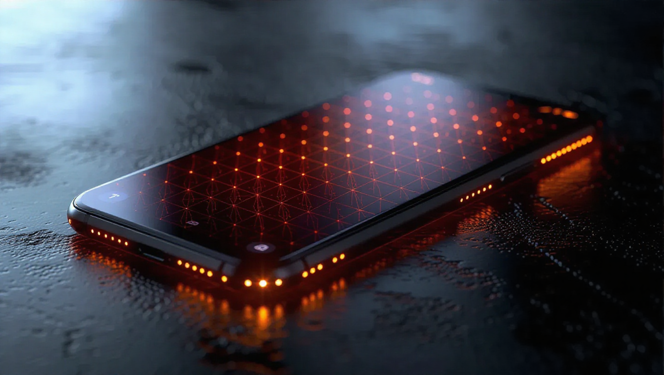
The Glyph Matrix—the array of LED lights on the phone's back—was a hallmark of the Nothing Phone 3 but was criticized by some as lacking meaningful utility at launch, described by one assessment as "dead on arrival." Although software updates later attempted to enhance its functionality, the initial impression highlighted a gap between concept and practical application. The Nothing Phone 4a is expected to build on these post-launch improvements from the ground up. The focus is reportedly on making the Glyph interface more integral and useful from day one, moving beyond a novel gimmick to become a genuinely functional part of the user experience.
A Cohesive Step Forward
Taken together, these adjustments position the Nothing Phone 4a as a more resolved product. Where the Phone 3 felt like an experiment with notable trade-offs, the 4a seems to refine that vision based on real-world use and critique. It maintains the core tenets of Nothing OS and capable camera hardware while realigning the physical design and interactive features to better meet user expectations. This approach indicates a maturing product strategy that listens to feedback.
Conclusion
The Nothing Phone 4a emerges not as a radical reinvention, but as a targeted and thoughtful iteration. By directly confronting the two most significant flaws of the Phone 3—its divisive design and the underdeveloped potential of the Glyph Matrix—the new model promises a more polished and satisfying experience. For those intrigued by Nothing's philosophy but hesitant about the previous generation's execution, the Phone 4a appears to be the compelling answer they've been waiting for.