Google Streamlines Gemini Android Interface with Decluttered Design
Google appears to be refining the user experience of its Gemini AI assistant on Android devices, with recent tests focusing on creating a cleaner, more organized interface. The changes aim to reduce visual clutter and improve usability for everyday interactions.
Separating Response and Input Areas
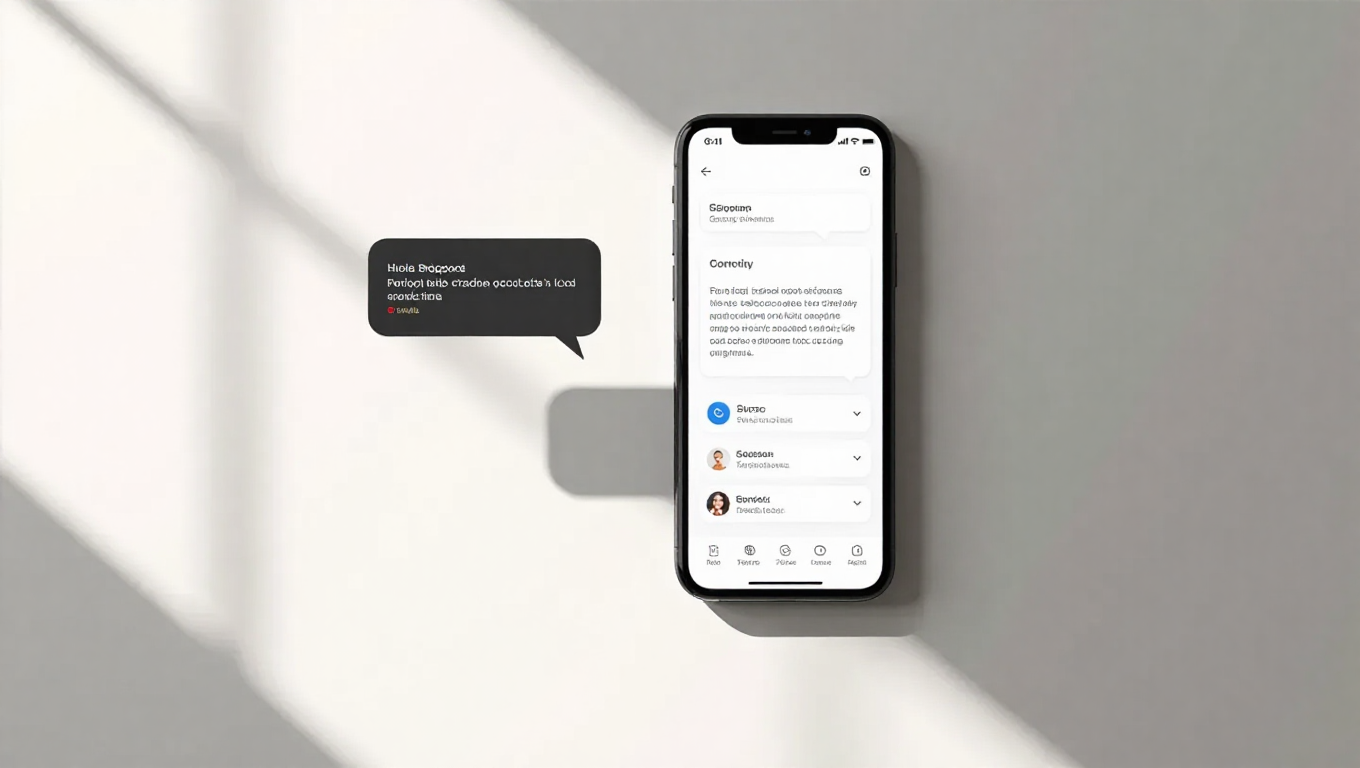
One of the most noticeable changes being tested involves the floating Gemini overlay interface. Currently, the AI's response and the user's input box exist within a single, continuous section. The new design introduces a clear separation between these two elements, creating distinct regions for Gemini's output and user input with a small visual gap between them.
This architectural shift represents more than just aesthetic refinement—it creates clearer mental models for users about where information comes from and where they should focus their attention. By separating the response area from the input field, Google appears to be addressing potential confusion that can arise when conversational interfaces blend these elements too closely.
Input Box Redesign
These interface changes follow earlier tests of a redesigned input box within the main Gemini interface. That redesign, spotted in December, already moved toward a cleaner appearance with simplified visual elements. The current tests suggest Google is extending this design philosophy to the floating overlay as well, creating consistency across different interaction modes.
The cleaner input design likely reduces cognitive load by removing unnecessary visual elements, allowing users to focus more on their queries and the AI's responses rather than navigating interface complexity.
Enhanced Temporary Chat Access
Alongside the visual refinements, Google is also testing improved methods for initiating temporary chats. Temporary chats, which don't save conversation history to user accounts, represent an important privacy feature for users who want to interact with Gemini without creating a persistent record.
While specific details about the new temporary chat implementation remain limited, the simultaneous testing of both interface cleanup and privacy feature accessibility suggests Google is taking a holistic approach to improving the Gemini experience—addressing both usability and user control in parallel.
Design Philosophy in Practice
The move toward decluttering aligns with broader design trends in mobile interfaces, where simplicity and clarity often trump feature density. For an AI assistant that users might invoke dozens of times daily, even minor reductions in visual noise can significantly improve the overall experience.
These refinements also reflect the maturation of conversational AI interfaces. As users become more accustomed to interacting with AI assistants, their needs evolve from novelty exploration to efficient utility. The cleaner interface suggests Google recognizes this transition and is optimizing Gemini for regular, practical use rather than just initial discovery.
Conclusion: Google's ongoing tests of a decluttered Gemini interface for Android signal the company's commitment to refining its AI assistant based on user experience principles. By separating response and input areas, cleaning up visual elements, and improving access to privacy features, these changes aim to make Gemini more intuitive and less distracting. While these are currently in testing and may evolve before wider release, they demonstrate Google's focus on creating AI interfaces that feel natural rather than overwhelming—a crucial consideration as AI assistants become increasingly integrated into daily mobile workflows.