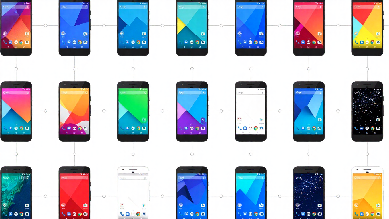
Google Showcases Pixel Colors Through the Years: A Visual Retrospective
As the tech world moves forward, companies often pause to reflect on their journey. Google has done just that with its Pixel smartphone line, releasing a visual retrospective titled "Pixel Colors Through the Years." This infographic serves as a vibrant timeline, charting the evolution of design aesthetics and color choices that have defined each generation of Pixel devices, from the pioneering original to the recently completed Pixel 10 series.
A Chromatic Journey from Pixel to Pixel 10
The infographic provides a clear, chronological view of Google's design philosophy. It begins with the more conservative and classic color options of the early Pixel models, which often featured staples like "Quite Black" and "Very Silver." These choices reflected a period where smartphone design across the industry tended toward safe, monochromatic palettes aimed at a broad professional audience.
The visual timeline shows a distinct shift as the series progressed. With the Pixel 3 and Pixel 4, bolder and more playful names and hues began to appear, signaling Google's confidence in appealing to users seeking personality in their devices. This trend accelerated notably with the Pixel 6 series, which introduced striking two-tone designs and vibrant colors like "Sorta Seafoam" and "Kinda Coral." The graphic highlights how these later generations embraced more expressive, saturated colors and unique material finishes, moving away from purely minimalist aesthetics.
Design Evolution and Market Positioning
This color history is more than just a palette swap; it mirrors Google's evolving market strategy for the Pixel line. The initial models positioned themselves as pure Android experiences with exceptional cameras, often using color to denote a clean, software-focused identity. Over time, as Google sought to carve a stronger niche against competitors, the hardware design and its chromatic identity became a more prominent selling point.
The retrospective underscores how color became a key differentiator. Limited-edition colors for certain models, like the iconic "Oh So Orange" for the Pixel 4, are noted as moments where Google experimented with creating buzz and desirability. The infographic culminates with the colors of the Pixel 10 series, showcasing a mature design language that balances premium materials with a diverse range of color options to suit various tastes, from subtle to statement-making.
Celebrating a Cohesive Identity
Beyond marketing, the "Colors Through the Years" graphic celebrates the development of a cohesive visual identity for the Pixel brand. While each generation introduced new elements, certain design threads—like the signature camera bar introduced with the Pixel 6—are maintained across evolving color schemes. This consistency helps build brand recognition, allowing users to identify a Pixel at a glance, regardless of its specific hue.
The release of this retrospective comes at a natural inflection point, following the completion of the Pixel 10 lineup. It acts as a capstone, allowing both Google and its user community to appreciate the design journey before the next chapter begins. It highlights how the company has used color not just as a cosmetic choice, but as an integral part of the product's character and appeal.
Conclusion: More Than Just a Pretty Palette
Google's "Pixel Colors Through the Years" is a succinct yet effective piece of brand storytelling. It transforms a simple list of model names and shades into a narrative about growth, experimentation, and identity. For enthusiasts, it's a nostalgic trip down memory lane. For industry observers, it's a case study in how a tech giant refined its hardware aesthetic over nearly a decade. As the Pixel line looks to the future, this colorful history sets the stage for the next evolution in smartphone design.