Google Refines Android's Live Updates with Visual Enhancements
Google is continuing to polish its Live Updates feature for Android with subtle but meaningful visual improvements. The latest Android Canary build reveals design tweaks aimed at enhancing usability and visual clarity for this real-time notification system.
Subtle Design Refinements for Better Visibility
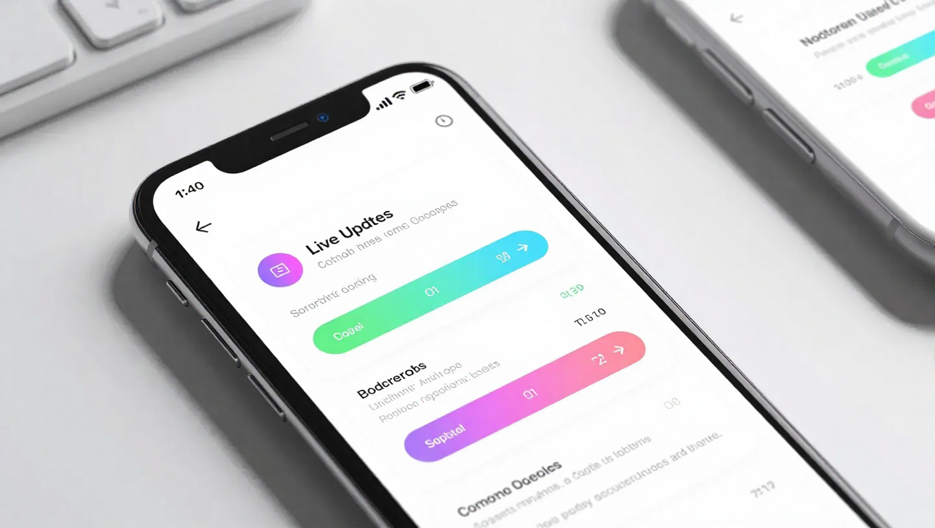
The most noticeable change in the latest build is a slightly wider progress bar for Live Updates. This modification appears designed to make the tracking of real-time activities more prominent and easier to follow at a glance. The progress bar now provides clearer visual feedback whether users are viewing it on the home screen, within the notification shade, or on the lock screen.
Alongside the progress bar adjustments, the update introduces more noticeable action buttons within Live Updates notifications. These buttons, which allow users to interact directly with ongoing activities, have received visual enhancements that make them stand out more clearly against the notification background. The improvements ensure that users can quickly identify and tap relevant actions without confusion.
Consistent Experience Across Interfaces
One of the key aspects of this update is consistency. The visual refinements apply uniformly across all display contexts where Live Updates appear. Whether users are checking their phone while it's locked, browsing their home screen, or pulling down the notification shade, they'll encounter the same polished interface. This consistency eliminates potential confusion and creates a more seamless user experience.
The design changes represent an evolutionary step rather than a complete overhaul. Live Updates, which Google introduced with Android 16, function as a special class of notifications that display real-time activity progress through horizontal progress bars. These notifications expand around the front-facing camera area in a manner reminiscent of iOS's Live Activities feature.
Expanding Use Cases Beyond Initial Vision
Originally conceived for applications like food delivery and ride-hailing services, Live Updates have shown potential for broader implementation. Testing has already begun with Google Maps, where the feature could display route segments differentiated by traffic density. This expansion suggests Google sees Live Updates as a versatile notification format adaptable to various real-time scenarios.
The visual refinements arriving in the Canary build indicate Google's commitment to refining this feature based on user feedback and usability observations. By making the progress tracking more prominent and action buttons more accessible, Google appears focused on ensuring Live Updates serve their purpose effectively without demanding excessive user attention.
Conclusion
Google's latest visual refinements to Android's Live Updates demonstrate the company's attention to detail in user interface design. The subtle but thoughtful changes to progress bar width and action button visibility show a commitment to improving usability through incremental enhancements. As Live Updates continue to evolve and potentially expand to more applications, these design refinements lay the groundwork for a more polished and intuitive real-time notification experience. The updates suggest Google is listening to user feedback and optimizing features that bridge the gap between notification and interactive experience.