Google Pixel Weather App Gets High-Contrast Icon Redesign for Better Accessibility
In a move that prioritizes clarity and inclusivity, Google is preparing to refresh the visual language of its Pixel Weather application. The update focuses on the app's iconography, transforming subtle, detailed weather symbols into bold, high-contrast designs. This shift is not merely aesthetic; it represents a deliberate effort to make essential weather information more legible and accessible to a broader range of users.
A Focus on Visibility and Inclusivity
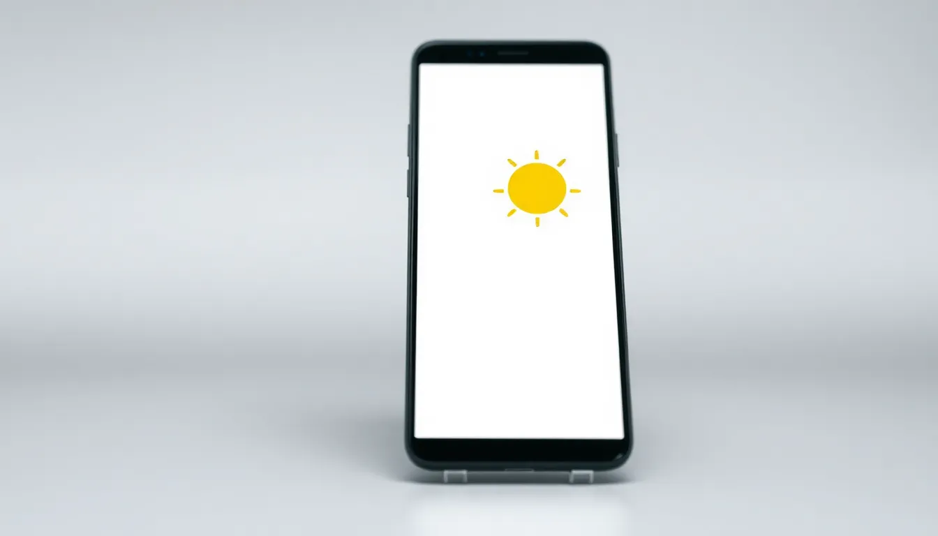
The core philosophy behind the redesign is enhanced visibility. The new icons reportedly abandon softer gradients and intricate details in favor of solid colors with stark contrasts against their backgrounds. For example, a sun icon may shift from a nuanced yellow orb to a bright, solid shape outlined clearly against a blue sky panel. Similarly, cloud and precipitation icons are expected to gain definition, making it easier to distinguish between conditions like light drizzle and heavy rain at a quick glance.
This approach directly addresses accessibility needs. Users with visual impairments, including those with low vision or color vision deficiencies, often struggle with low-contrast UI elements. By boosting contrast, Google is ensuring that a fundamental piece of daily information—the weather—is perceivable by more people without requiring zoom or additional assistive tools. The change aligns with broader industry trends and guidelines, such as the Web Content Accessibility Guidelines (WCAG), which emphasize sufficient color contrast for text and graphics.
Integrating a Dedicated Pixel Experience
The update underscores Google's commitment to crafting a distinct software experience for its Pixel hardware. The Pixel Weather app itself is a relatively recent addition, launched as a dedicated application for Pixel devices after years of relying on more generic solutions or integrations within the Google app. This dedicated app allows for deeper integration with the Pixel's At a Glance widget and other system features.
Redesigning its icons is a logical next step in maturing this first-party application. It signals that Google views the weather app not as a simple utility, but as an integral part of the Pixel user interface where design coherence and user experience matter. The high-contrast icons are likely to complement the clean, material design language found elsewhere in the Pixel software ecosystem while serving a clear functional purpose.
Rollout and User Impact
The icon overhaul is expected to be delivered via a server-side update or an app update through the Google Play Store in the coming weeks. Such updates typically roll out gradually, so not all users will see the changes immediately. The update should apply to the Pixel Weather app across compatible Pixel devices, requiring no direct action from the user once it is available for their device and region.
For the average user, the change will manifest as a noticeably crisper and clearer weather interface. The primary benefit is utilitarian: faster comprehension of weather conditions. This can be particularly valuable when checking the weather briefly while on the move or in varying lighting conditions. While some users accustomed to the older, more illustrative style may need a short adjustment period, the design is fundamentally geared towards reducing cognitive load and improving readability for everyone.
Conclusion
Google's decision to revamp the Pixel Weather app icons with a high-contrast design is a thoughtful update that places accessibility and clarity at the forefront. By moving from detailed illustrations to bold, easily distinguishable symbols, the company is enhancing the daily usability of its app for all users, especially those with visual challenges. This refresh strengthens the Pixel's software identity and demonstrates how thoughtful design choices can make everyday technology more inclusive and effective. It's a clear example of how prioritizing accessibility in design ultimately creates a better experience for every user.