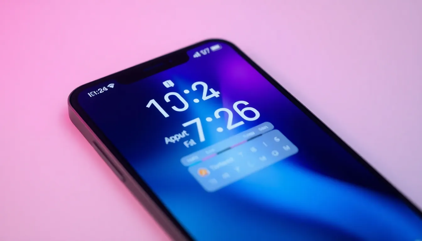
Google Pixel Introduces High-Contrast Design for At a Glance Widget
Google is rolling out a significant visual update to one of the Pixel's most recognizable features. The At a Glance widget, a staple on Pixel home screens, is receiving a new high-contrast design option. This change addresses a common user request for improved readability and accessibility, marking a thoughtful evolution of the widget's functionality.
A Long-Awaited Enhancement
The At a Glance widget has been a core part of the Pixel experience for years, providing users with quick access to calendar events, weather, commute times, and other contextual information directly on the home screen. While functional, its design has sometimes been critiqued for lacking sufficient contrast against certain wallpapers, making the text difficult to read at a glance—ironic given its name. The introduction of a dedicated high-contrast mode directly tackles this issue.
Initial reports indicate the new setting alters the widget's appearance to feature bolder, more distinct text and background elements. This design shift prioritizes clarity, ensuring the information is legible across a wider variety of backgrounds and lighting conditions. For users who rely on the widget for quick information, this update could significantly enhance daily usability.
Focus on Accessibility and User Choice
This update is more than a simple aesthetic tweak; it represents a meaningful step in accessibility. High-contrast modes are essential for many users with visual impairments, reducing eye strain and improving information comprehension for a broader audience. By building this option directly into the widget's settings, Google is empowering users to customize their experience based on their individual needs and preferences.
The move aligns with a growing industry emphasis on inclusive design, where software is developed to be usable by as many people as possible. It suggests that user feedback regarding the widget's visibility has been heard and acted upon. The implementation appears to be an optional setting, allowing those who prefer the original, more subdued design to retain it, while others can opt for the enhanced clarity of the new mode.
Implications for the Pixel Ecosystem
The enhancement of the At a Glance widget underscores Google's commitment to refining its first-party software experience on Pixel devices. As a signature feature, its ongoing development is closely watched. This update may be part of a broader visual refresh or accessibility initiative within the Pixel software suite, potentially hinting at similar high-contrast options for other system elements in future updates.
For the average user, the change promises a more reliable and readable information hub on their home screen. It removes a minor but persistent friction point, making the device slightly more intuitive and user-friendly. The update is currently being spotted in early software builds, suggesting a wider rollout could be imminent for supported Pixel models.
Conclusion
The addition of a high-contrast design to the Pixel's At a Glance widget is a welcome and practical update. It successfully addresses user feedback concerning readability while championing accessibility principles. This thoughtful refinement enhances a core Pixel feature without altering its fundamental purpose, ensuring that users can truly get the information they need at a glance. It's a clear example of how iterative software improvements can meaningfully improve the daily user experience.