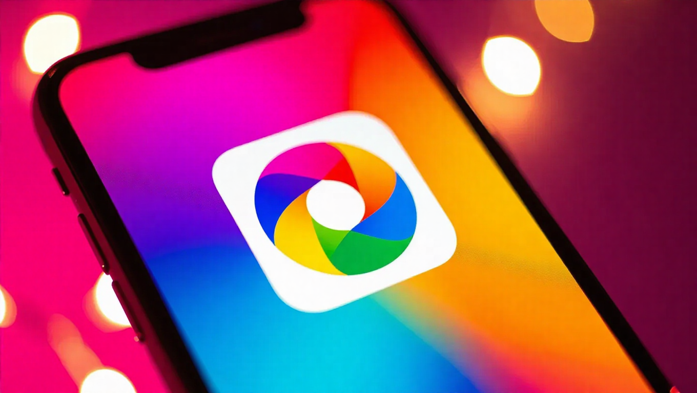
Google Photos 7.55 Introduces Gradient Icon Redesign Across Android and iOS Platforms
Google has begun rolling out a visual refresh for its popular photo management application, with Google Photos version 7.55 featuring a redesigned gradient icon now available on both Android and iOS devices. This update represents the latest evolution in Google's ongoing efforts to modernize its app icons across its product ecosystem.
Visual Refresh for a Familiar App
The new icon design maintains the recognizable pinwheel shape that has become synonymous with Google Photos but introduces a vibrant gradient background. The multi-color gradient creates a more dynamic visual appearance compared to the previous solid-colored icon versions. This change aligns with broader design trends in the tech industry, where gradient effects have become increasingly popular for adding depth and visual interest to app icons.
The redesign appears to be part of Google's systematic approach to updating its app icons across multiple platforms. Users on both Android and iOS are reporting the new icon appearance, indicating a cross-platform rollout strategy. The update seems to be server-side enabled, meaning users may see the new icon without needing to manually update their app through app stores.
Gradual Rollout Strategy
As with many Google updates, the gradient icon redesign appears to be rolling out gradually to users worldwide. Some users have reported seeing the new icon design as early as the beginning of the month, while others are just now receiving the visual update. This staggered approach is typical for Google's deployment strategy, allowing the company to monitor user reception and address any potential issues before wider distribution.
The update comes as version 7.55 of Google Photos, though the icon change itself appears to be controlled server-side rather than being tied to a specific app version. This means users with older versions of the app might still see the new icon if Google has enabled it for their account.
Design Consistency Across Platforms
One notable aspect of this redesign is its consistency across both major mobile platforms. Android and iOS users are receiving the same gradient icon design, maintaining visual parity regardless of device. This approach ensures that Google Photos maintains a cohesive brand identity across the competitive mobile ecosystem.
The gradient effect used in the new icon features a smooth transition between colors, creating a more modern and polished appearance. While the core functionality of Google Photos remains unchanged, the visual refresh helps keep the app looking current alongside other applications in users' app drawers and home screens.
Conclusion
The introduction of the gradient icon redesign for Google Photos represents another step in Google's ongoing visual evolution of its product suite. While cosmetic rather than functional, these design updates play an important role in keeping applications feeling fresh and modern. The cross-platform rollout demonstrates Google's commitment to maintaining consistent branding across Android and iOS, ensuring that millions of users worldwide will enjoy the same visual experience regardless of their preferred mobile platform.
As the rollout continues, users can expect to see the new gradient icon appearing on their devices, marking the latest chapter in Google Photos' visual journey while the core photo management capabilities that users rely on remain unchanged and fully functional.