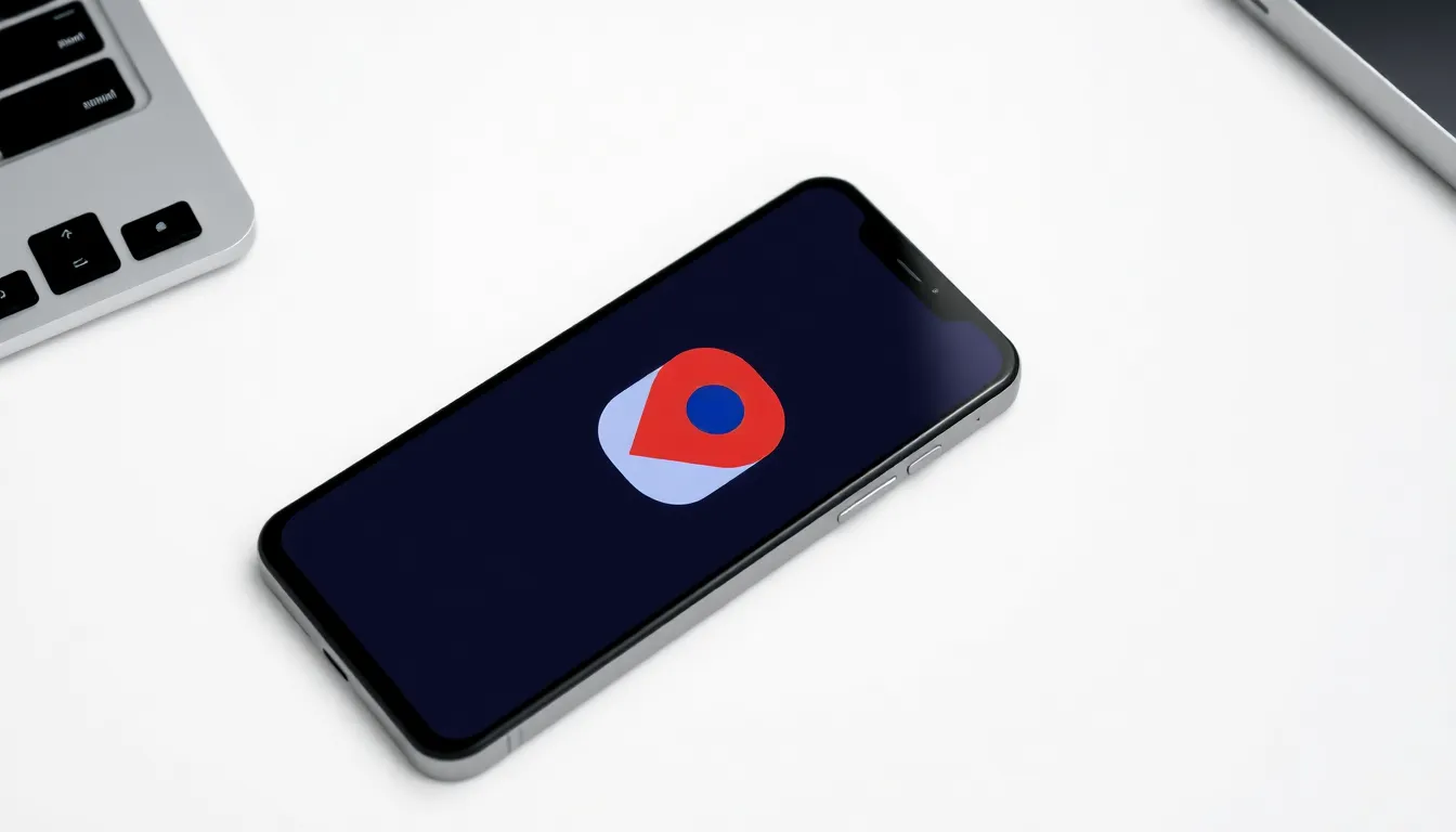
Google Maps for Android Introduces Gradient Icon Redesign
Google Maps, the ubiquitous navigation and local discovery app, is receiving a subtle but noticeable visual refresh on Android devices. The update centers on the app's icon, which is transitioning from its familiar solid-color pin to a new gradient design.
A Gradual Visual Shift
The redesign replaces the classic solid red pin with a gradient that blends shades, creating a more dynamic and modern look on the home screen and app drawer. This change aligns with a broader trend in digital design where flat, solid colors are being supplemented or replaced by gradients to add depth and visual interest. The core functionality of the Google Maps application remains unchanged; this is purely an aesthetic update to its branding icon.
The rollout appears to be server-side and gradual, meaning not all Android users will see the new icon immediately. Updates of this nature typically reach users over days or weeks, independent of a full app update from the Google Play Store. Users may notice the new icon appear on their device without taking any action.
User Reception and Design Context
Initial user reactions to the gradient icon have been mixed. Some users appreciate the refreshed, contemporary look, noting that it feels more aligned with current design aesthetics. Others express a preference for the simplicity and instant recognizability of the classic solid icon, which has been a staple on Android devices for years.
This icon update is part of Google's ongoing efforts to refine its visual identity across its product ecosystem. Similar gradient-style icons have been spotted or implemented in other Google apps, suggesting a coordinated move towards a more cohesive and modern design language. The change, while minor, signifies Google's attention to keeping its flagship apps visually current.
Conclusion
The new gradient icon for Google Maps on Android represents a small step in the app's visual evolution. While the navigation experience inside the app continues unchanged, the updated icon offers a fresher face to one of the world's most-used mobile applications. As the rollout completes, the gradient design will become the new standard, marking another chapter in the app's long history on the Android platform. Users can expect to see the updated icon appear on their devices in the coming days if it hasn't already.