A Cleaner, Unified Gemini Interface Could Be Coming to Your Android Phone
Google's Gemini AI assistant on Android may soon receive a significant visual overhaul, bringing it closer in design and functionality to its web counterpart. Recent developments suggest the company is actively testing interface changes aimed at creating a more consistent and streamlined user experience across platforms.
Bringing Web Design Principles to Mobile
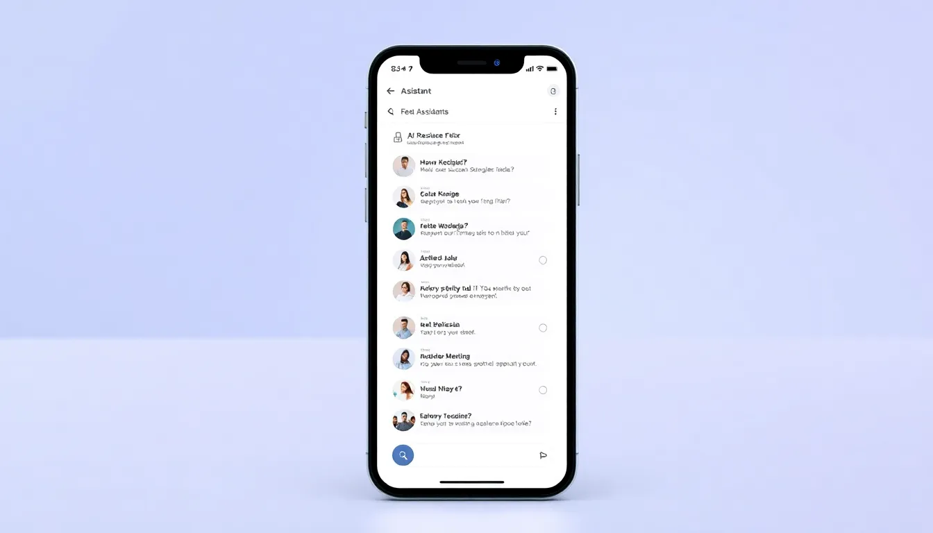
The most notable change appears to be the introduction of a sidebar interface similar to what users encounter on Gemini's web version. This sidebar would include a dedicated "Settings & help" menu, making essential controls more accessible and organized. The move represents a shift toward unifying the Gemini experience, potentially reducing the learning curve for users who switch between mobile and desktop platforms.
Currently, the Gemini Android app exists as an extension of the main Google app, while the web version operates through browsers. Many users prefer the dedicated Android app for mobile use, but those accustomed to the web interface on computers might find the mobile experience less intuitive. This redesign could bridge that gap, offering a more familiar layout to web users while maintaining mobile-optimized functionality.
Decluttering the Interface
Beyond the sidebar addition, Google seems focused on reducing visual clutter within the Gemini app. One significant change under consideration involves relocating the model switcher from its current position in the text input field to the top header area. This repositioning would free up valuable screen real estate in the conversation area while making model selection more prominent and accessible.
Another potential improvement concerns how Gemini highlights extensions. Current indications suggest Google might modify the interface to focus on the last-used extension rather than displaying all available options prominently. This approach could simplify the user interface while still providing easy access to frequently used tools like travel planning, document analysis, or code generation features.
Toward a More Consistent AI Experience
These interface changes reflect Google's broader effort to create a cohesive Gemini ecosystem. By aligning the Android app more closely with the web version, the company could reduce fragmentation and make the AI assistant more approachable for new users. The cleaner layout might also help users focus on conversations rather than navigating interface elements.
The timing of these potential changes coincides with increasing competition in the AI assistant space, where user experience plays a crucial role in adoption and retention. A more intuitive, consistent interface could help Gemini stand out in a crowded market while appealing to both casual users and those who rely on the assistant for productivity tasks.
Conclusion
While these interface changes remain in testing, they signal Google's commitment to refining the Gemini experience on Android. The move toward a cleaner, more unified design that mirrors the web version could make the AI assistant more accessible and enjoyable to use. As AI assistants become increasingly integrated into daily workflows, such interface improvements could significantly impact how users interact with and benefit from these powerful tools. The potential decluttering of the interface, particularly through the sidebar addition and repositioned controls, suggests Google is listening to user feedback and working to create a more polished mobile AI experience.