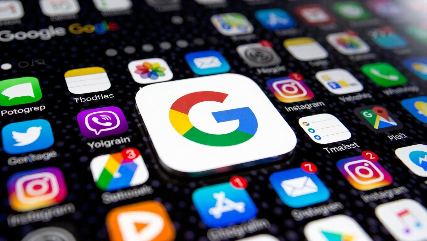
Google App Icon Size Increases in Latest Android Beta Update
In a quiet but noticeable change, the Google app icon on Android devices has received a size increase. This visual adjustment, spotted in the latest beta version of the app, represents one of the first notable tweaks of the new year in the ongoing evolution of Google's mobile software.
A Subtle Shift in Visual Design
The change, implemented in beta version 17.0 of the Google app, enlarges the application's primary icon. For users running this test build, the familiar multicolored "G" now occupies more space on the home screen or within the app drawer. This modification, while minor, directly impacts the app's visual footprint and how it integrates with other icons in a user's interface layout.
Icon sizing is a fundamental aspect of user interface design, affecting readability, tap targets, and overall aesthetic cohesion. A larger icon can improve accessibility and make the application easier to locate at a glance. This update suggests a continued refinement of Google's design language on its native platform, focusing on clarity and user experience even in small details.
Context and User Impact
As a beta release, this change is currently available to a limited group of testers who opt into Google's pre-release programs. It typically precedes a wider rollout to all users in the stable channel of the Google Play Store. The update appears focused solely on the Android iteration of the app, with no immediate indication of a similar change for other platforms.
Initial observations from the beta community highlight the change as purely visual, with no reported alterations to the app's functionality, features, or internal performance. The core search experience, Assistant integration, and other services within the app remain unchanged. The adjustment seems designed to modernize the app's presentation and ensure consistency with potential future design guidelines or icon grid systems on Android.
Conclusion
The enlargement of the Google app icon, though a small detail, is a deliberate step in the app's visual development. It underscores Google's attention to the minutiae of its mobile ecosystem, even for its flagship application. For the average user, the change will manifest as a slightly more prominent icon on their screen. For observers of design trends, it may signal ongoing efforts to refine Android's visual identity. As this update progresses from beta to general availability, it will be interesting to see if it accompanies further interface refinements or remains a standalone aesthetic tweak.