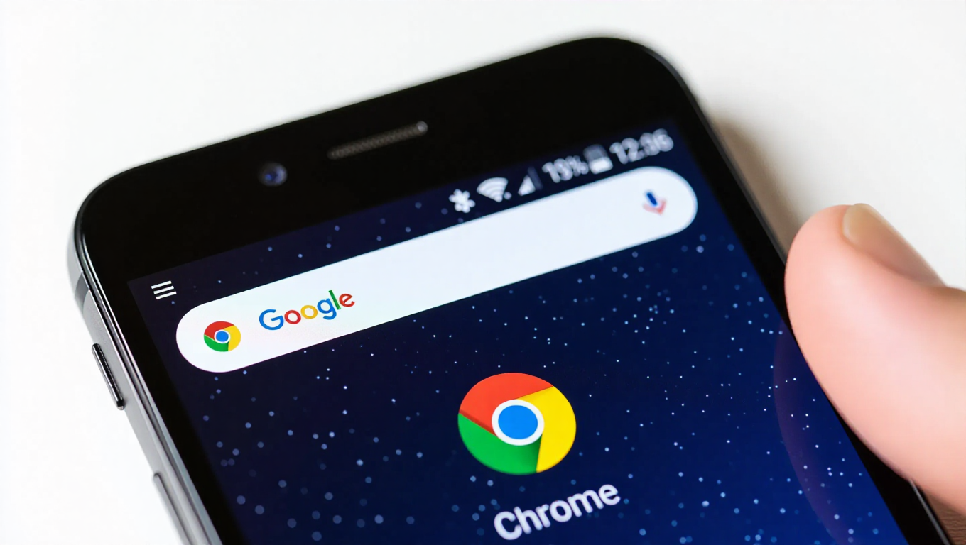
Chrome's Home Icon Gets a Subtle Redesign on Android
Google Chrome, the world's most popular web browser, has introduced a minor but noticeable visual update to its Android app. The change centers on the Home icon located within the browser's address bar, signaling a fresh look as part of the latest software rollout.
The Visual Update
The update arrives with Chrome 145, which is now widely available for Android users. The Home icon, traditionally a simple house outline positioned to the left of the address bar, has been redesigned. While still maintaining its core function—a quick tap returns users to their homepage—the icon's appearance has been refined. The new design features subtle alterations to its shape and lines, offering a more modern aesthetic that aligns with Google's ongoing efforts to refresh its product interfaces.
This change is purely cosmetic and does not alter the icon's functionality or its placement within the Chrome interface. Users familiar with the previous icon will immediately notice the difference, though the learning curve for using the feature remains nonexistent.
Rollout and User Experience
The update is part of the standard Chrome version 145 release for Android. As with most Chrome updates, it is distributed via the Google Play Store and should reach devices automatically over the coming days. Users can manually check for updates in the Play Store to receive it immediately.
Initial observations suggest the change is receiving a neutral to positive reception. The redesign is seen as a minor refresh rather than a significant overhaul, fitting seamlessly into the existing Chrome interface without disrupting user habits. There are no reports of the update affecting browser performance, stability, or other features.
Context and Design Philosophy
Icon updates in major apps like Chrome are not uncommon. Google frequently iterates on its design language across its ecosystem, aiming for consistency, clarity, and a contemporary look. This Home icon change appears to be part of that broader effort, possibly refreshing elements to match evolving design standards or preparing for future interface adjustments.
It's worth noting that such subtle icon modifications often precede or accompany larger visual updates, though no major Chrome redesign for Android has been announced alongside this change. The focus remains on a single, specific UI element being polished.
Conclusion
The update to Chrome's Home icon on Android is a small but clear example of Google's continuous design refinement. While functionally identical, the new icon offers a slightly updated visual identity within the browser. For most users, the change will be a minor detail noticed in passing, but it underscores the ongoing evolution of even the most familiar digital tools. As Chrome 145 rolls out, Android users can expect this refreshed icon to become the new normal in their browsing experience.