Blur is the New Bold: User Reactions to Android 17's Frosted Interface Updates
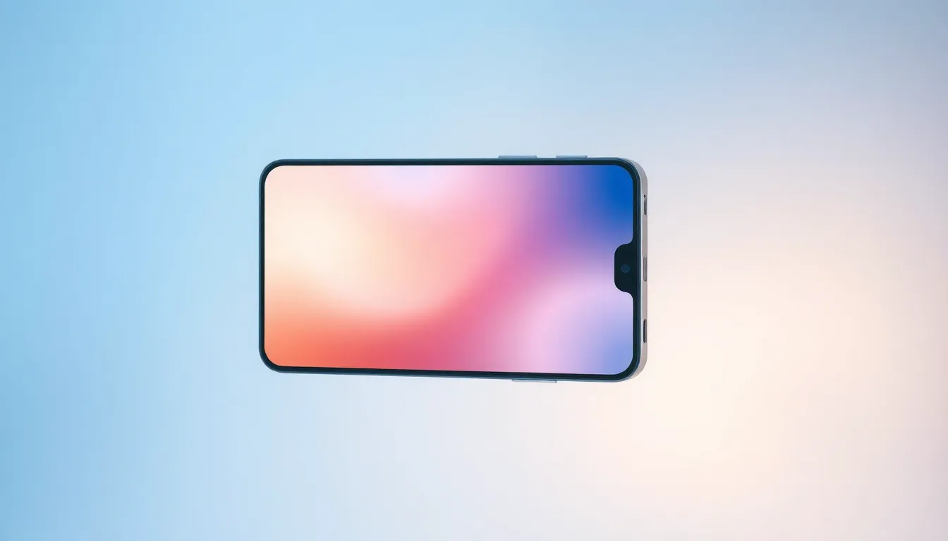
Visual design trends in mobile operating systems continue to evolve, with blur effects emerging as a prominent aesthetic choice. Recent leaks of Android 17's interface reveal Google's significant shift toward frosted, translucent elements that allow background colors and imagery to subtly show through. This design direction mirrors broader industry movements while sparking diverse opinions among the Android community.
The Frosted Aesthetic: Design Evolution or Distraction?
Initial images of Android 17 showcase extensive blur effects applied to various interface components. Menus, notifications, and system panels appear with a translucent quality that creates depth and visual interest. This approach represents a departure from previous Android versions' cleaner, more opaque designs and aligns with contemporary design philosophies emphasizing layered interfaces.
Community feedback reveals a spectrum of reactions to this visual overhaul. Some users appreciate the modern, sophisticated appearance, noting that the frosted effects create a cohesive visual language that enhances the overall user experience. Others express concerns about potential readability issues, particularly in bright lighting conditions or with complex backgrounds.
Functionality Versus Aesthetics: The User Experience Debate
Beyond pure aesthetics, discussions center on how these visual changes impact practical usability. Proponents argue that well-implemented blur effects can improve visual hierarchy, helping users distinguish between foreground and background elements more intuitively. They suggest that when executed properly, these effects can enhance rather than hinder functionality.
Critics counter that excessive blurring may reduce text legibility and create visual noise, particularly for users with visual impairments or those operating devices in challenging lighting environments. Some community members question whether these design choices prioritize trendiness over accessibility, urging Google to maintain clear usability standards alongside visual innovation.
Industry Context and Future Implications
The move toward blurred interfaces reflects broader industry patterns, with multiple manufacturers incorporating similar effects into their software skins. This convergence suggests a shared design direction across the mobile ecosystem, though implementation approaches vary significantly between companies.
Looking forward, the success of Android 17's visual approach may depend on Google's ability to balance aesthetic ambition with practical considerations. Early indications suggest the company is exploring ways to make these effects customizable, potentially allowing users to adjust intensity or disable them entirely based on personal preference and situational needs.
Conclusion: A Polarizing but Promising Direction
Android 17's frosted interface represents both a bold design statement and a potential usability challenge. While initial reactions remain divided, the underlying conversation highlights users' growing sophistication about interface design and their expectations for both beauty and functionality. As development continues, the ultimate test will be whether these visual innovations enhance the Android experience without compromising the platform's renowned versatility and accessibility. The coming months will reveal whether blur truly becomes the new bold or remains a controversial experiment in mobile interface evolution.