Here's Why Your Android Auto Music Controls Look Different This Morning
Android Auto users are waking up to a noticeable change in their in-car music experience. The familiar music playback interface has undergone a significant redesign, bringing a more consistent look across different music streaming applications.
The New Media Playback Template
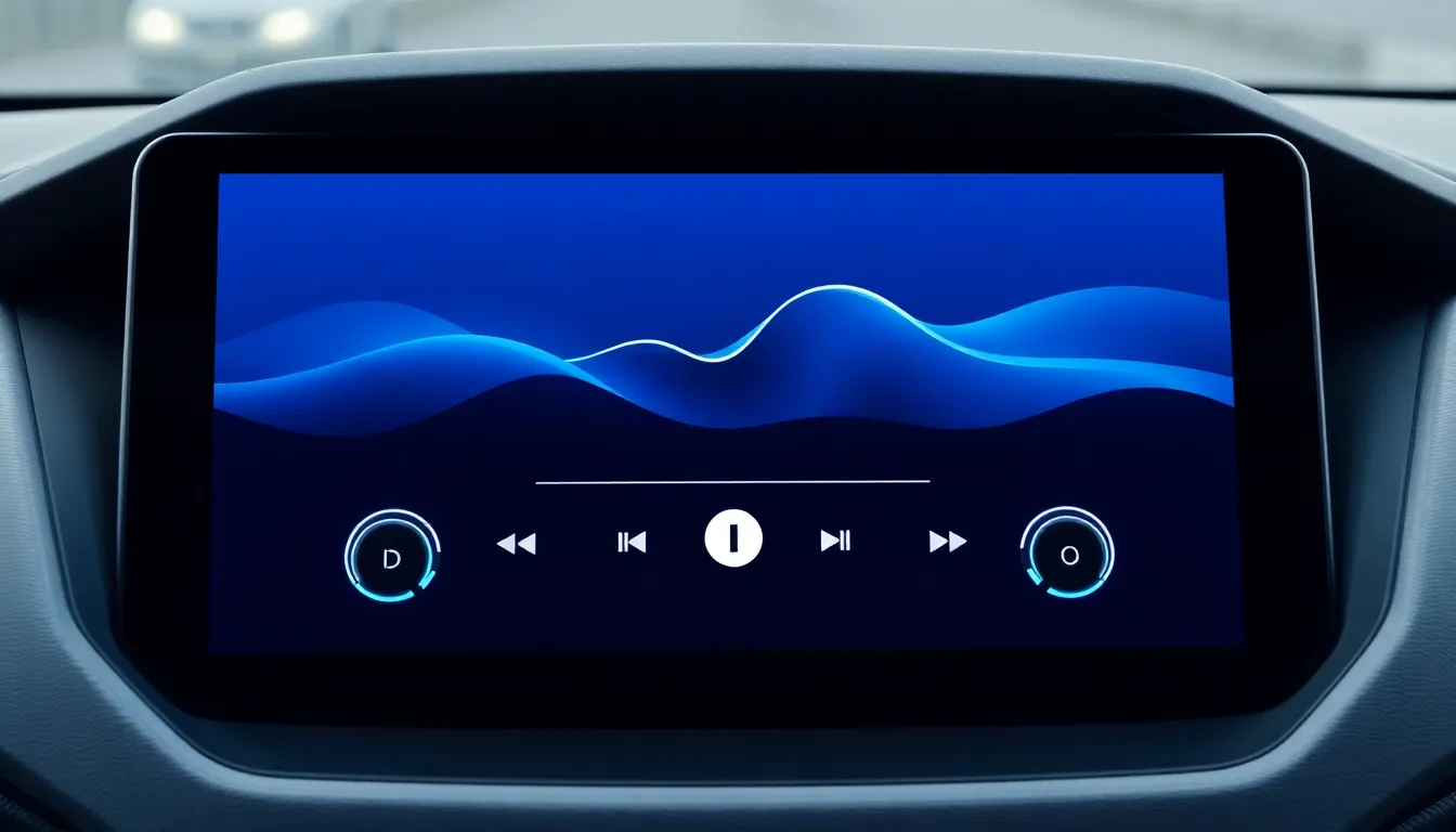
The visual overhaul represents the wider rollout of Google's new Media Playback template for Android Auto. This standardized interface framework was introduced last year to provide music player apps with a consistent user experience. The template ensures that whether you're using Spotify, YouTube Music, or other compatible applications, the playback controls will maintain the same layout and functionality.
One of the most distinctive new features is the wavy progress bar that replaces the traditional linear timeline. This visual element adds a dynamic touch to the interface while maintaining clear progress indication. The playback controls have also been repositioned, with the Play/Pause and track navigation buttons now located on the left side of the screen rather than centered or right-aligned as in previous versions.
Server-Side Rollout
The changes are being implemented through a server-side switch, meaning users don't need to manually update their Android Auto app to receive the new interface. As long as the application is up to date, the new music controls may appear automatically. This rollout method explains why some users are seeing the changes while others with identical app versions might not yet have the updated interface.
The template-based approach offers significant advantages for both developers and users. Music app developers can implement the standardized controls more easily, while users benefit from a consistent experience regardless of which music service they prefer. This consistency reduces the learning curve when switching between different music applications while driving.
Future Improvements
The new Media Playback template is designed to accommodate future enhancements that will apply equally to all compatible music player applications. This means that any interface improvements Google introduces to the template will automatically benefit all apps that utilize it, ensuring a unified evolution of the Android Auto music experience.
The update represents Google's ongoing effort to refine the Android Auto experience, particularly for media consumption during drives. By standardizing the music playback interface, the company aims to reduce driver distraction while providing intuitive controls for common music functions.
Conclusion
The redesigned Android Auto music controls mark a significant step toward interface consistency across different music streaming services. The wavy progress bar and relocated playback buttons provide a fresh look while maintaining functionality. As the server-side rollout continues, more users will discover the updated interface in their vehicles, experiencing a more uniform music playback experience regardless of their preferred streaming service.
This update demonstrates Google's commitment to improving the in-car entertainment experience through standardized templates that benefit both developers and end-users. The changes reflect ongoing efforts to make Android Auto more intuitive and visually cohesive while maintaining focus on driver safety and convenience.