These Key Android Auto Icons Could Soon Get an Android 16-Flavored Refresh
Google appears to be bringing its latest mobile design philosophy to the in-car experience. Recent discoveries within Android Auto's code reveal a visual refresh in the works for key status icons, specifically those indicating cellular connectivity, aligning them more closely with the aesthetic of the upcoming Android 16.
A Rounder, More Modern Look
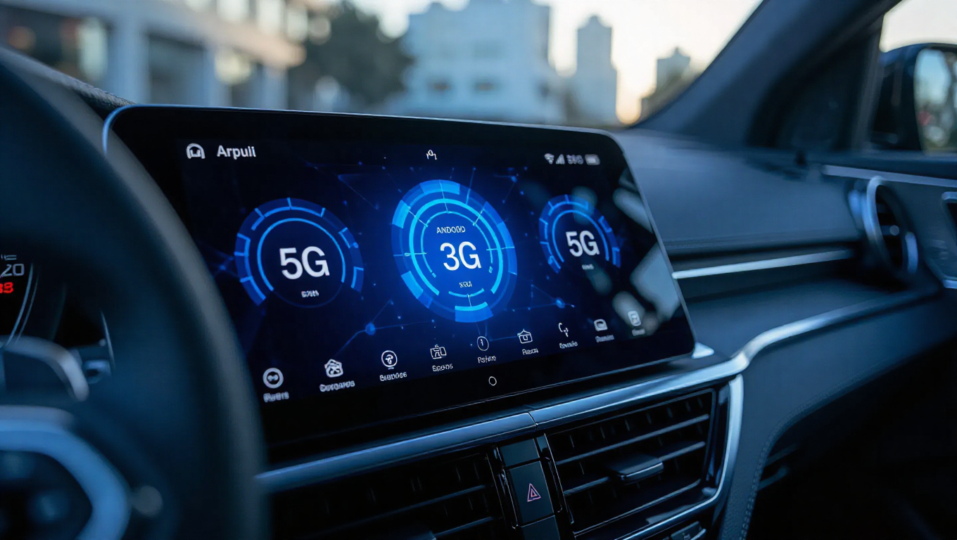
The most noticeable change is a shift in iconography. The current sharp-edged, triangular signal strength indicator is being replaced with a set of rounder, more modern icons. These new icons display individual bars to represent signal strength, moving away from the previous shaded triangle design. Accompanying typography for the cellular network type (e.g., 5G, LTE) has also been updated to complement the new visual style.
This change is not merely cosmetic; it represents a deliberate effort to create a more cohesive visual ecosystem. By adopting design cues from Android 16, Google is working to reduce the perceived gap between the user's phone interface and the Android Auto projection on their vehicle's display. This follows other recent interface experiments, such as testing dynamic color changes for vehicle avatars within the Android Auto interface.
Hints at a Broader Theme Update
The discovery of these new icons also serves as another strong indicator that Google's work on a light theme for Android Auto is ongoing. A light theme has been a highly requested feature for years, aimed at improving daytime visibility and offering user choice. The development of these new icons, which would need to be legible in both dark and light modes, suggests parallel progress on the broader theming system.
While these icons are currently in testing and not yet available in public builds, their presence confirms active development. The update, when released, would mark a subtle but significant step in refining Android Auto's visual identity, making it feel less like a separate platform and more like a natural extension of the user's Android smartphone.
Conclusion
The visual evolution of Android Auto continues, with a focus on harmony and modernity. The impending refresh of cellular status icons to match Android 16's design language is a clear signal of Google's intent to create a more unified and polished cross-device experience. For users, this means an in-car interface that is not only functionally robust but also visually consistent with the device in their pocket, with the added promise of a light theme drawing closer to reality.