Android 17 Rumored to Introduce Apple-Inspired Liquid Glass UI Elements
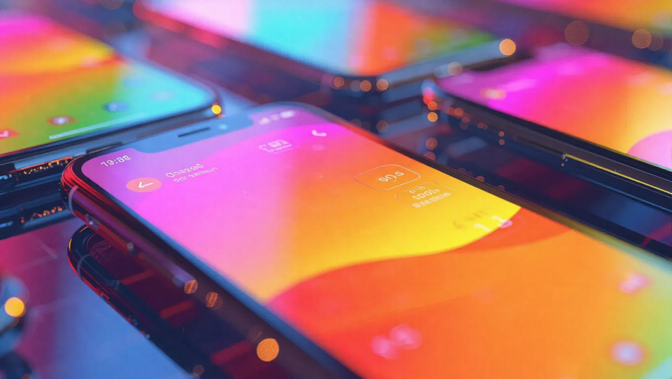
As anticipation builds for Android 17's official launch later this year, reports suggest Google is preparing a significant visual overhaul that could bring Apple's Liquid Glass aesthetic to the Android ecosystem. The next major Android version, codenamed "Cinnamon Bun," appears poised to move away from the flat, solid-color designs that have dominated recent iterations in favor of translucent, blur-heavy visuals that create depth and dimension.
The Shift Toward Translucent Design
Android 17 is said to be implementing a frosted-glass look across core user interface elements, including the volume slider and power menu. This represents a continuation of design principles introduced with Material 3 Expressive last year, which brought subtle blurs to the notification shade and Quick Settings panel. The approach aims to create a lightweight interface that feels less like an opaque wall of color blocking the user's view and more like a layered, dimensional experience.
The translucent design philosophy appears to prioritize visual hierarchy and spatial awareness, allowing background content to subtly show through UI elements while maintaining readability and functionality. This represents a significant departure from the flat design language that has characterized Android interfaces for several years, suggesting Google is responding to evolving user expectations around visual sophistication and depth perception in mobile interfaces.
Dynamic Color Integration
Reports indicate that Dynamic Color will play a crucial role in Android 17's new visual approach, automatically tinting blurred panels to help transparency effects blend seamlessly with the user's wallpaper and theme. This intelligent color adaptation could ensure that translucent elements remain readable and aesthetically pleasing regardless of the background content, addressing potential accessibility concerns while maintaining visual consistency.
The integration of Dynamic Color with translucent effects suggests Google is working to create a more cohesive and personalized visual experience. By allowing UI elements to adapt to the user's chosen color scheme and wallpaper, Android 17 could offer a level of visual harmony that goes beyond simple theme application, potentially creating a more immersive and integrated user experience.
Design Evolution and Industry Trends
The rumored design direction for Android 17 reflects broader industry trends toward more sophisticated visual interfaces that prioritize depth, texture, and subtle animation. While the approach bears similarities to Apple's Liquid Glass aesthetic, early indications suggest Google is adapting these principles to fit Android's design language and user expectations rather than simply copying competitor features.
This evolution in Android's visual design represents a natural progression from the foundations laid by Material 3 Expressive, which introduced the concept of depth through blur effects. Android 17 appears poised to expand these principles throughout the operating system, potentially creating a more consistent and modern visual experience across all interface elements.
Conclusion
While Android 17 remains months from its official release, the rumored shift toward translucent, blur-heavy visuals suggests Google is preparing a significant design evolution for its mobile operating system. The potential introduction of frosted-glass effects across core UI elements, combined with intelligent Dynamic Color integration, could create a more sophisticated and visually engaging user experience. As development continues, users can expect to see how these design principles translate into practical interface improvements that balance aesthetic appeal with functionality and accessibility.