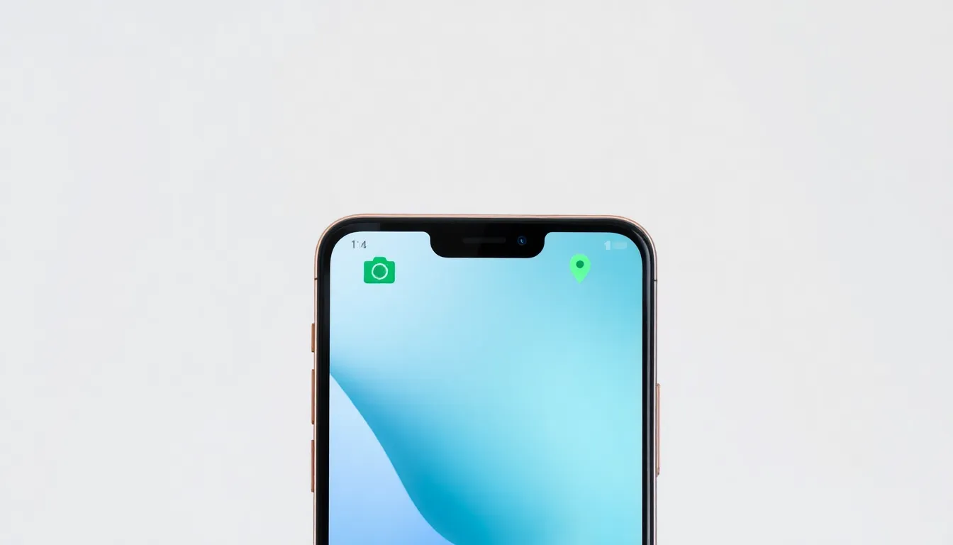
Android 17 Beta 2 Streamlines Privacy Indicators and Interface Design
Google's iterative development of Android 17 continues with the release of Beta 2, which brings notable refinements to user privacy notifications and visual design language. This update focuses on enhancing clarity for users when their device's sensitive features are in use, while subtly shifting the overall aesthetic direction of the operating system.
Refreshed Privacy Icons for Instant Recognition
The most prominent change in this beta release is a complete overhaul of the privacy indicators that appear in the status bar. When an application accesses the device's location or camera, new icons are now displayed. These icons have been redesigned with simplicity and instant recognizability as the primary goals. The new designs are less cluttered and more symbolic, allowing users to immediately understand which resource is being accessed without needing to interpret complex graphics. This marks the second recent adjustment Google has made to how these critical privacy notifications are presented, indicating a focused effort on improving this aspect of the user experience.
A Departure from the Wide Design Language
Alongside the icon refresh, Android 17 Beta 2 appears to be moving away from the "wide" design elements that characterized some parts of the interface in earlier previews. This design language, which utilized expansive spacing and broad visual elements, has been scaled back in favor of a more conventional and potentially space-efficient layout. The change suggests Google is refining the visual hierarchy and density of information presented on screen, possibly to improve usability or to align with different hardware form factors. The overall interface feels more consolidated, with UI elements adopting a more standard proportion relative to screen space.
Implications for User Clarity and System Aesthetics
The updates in Beta 2 serve a dual purpose. First, the redesigned privacy icons directly address user awareness. In an era where data privacy is paramount, providing clear, unambiguous signals when the camera or location services are active is a crucial feature. The new icons reduce the cognitive load required to understand device status. Second, the shift away from the wide design philosophy represents an ongoing calibration of Android's visual identity. It shows a willingness to experiment with and then refine design concepts based on practical feedback and development goals, rather than rigidly adhering to a single aesthetic direction throughout the beta cycle.
Conclusion
Android 17 Beta 2 demonstrates Google's commitment to polishing both the functional and visual aspects of its upcoming operating system. By introducing more intuitive privacy indicators and refining the interface's design language, this build enhances transparency for users and streamlines the overall look and feel. These changes, while seemingly incremental, are significant steps in shaping a more user-friendly and coherent final product. As the development cycle progresses, these foundational improvements in clarity and design will likely form the basis for more feature-centric updates in future betas.