Android 16 QPR2's Color Upgrade Enhances Widget Visibility and Accessibility
The latest Android 16 QPR2 beta reveals substantial visual improvements coming to Pixel devices, with particular focus on enhancing the user interface through sophisticated color management. These changes promise to make widgets more visually appealing and functionally superior.
Vibrant Color Palettes Transform Search Widget
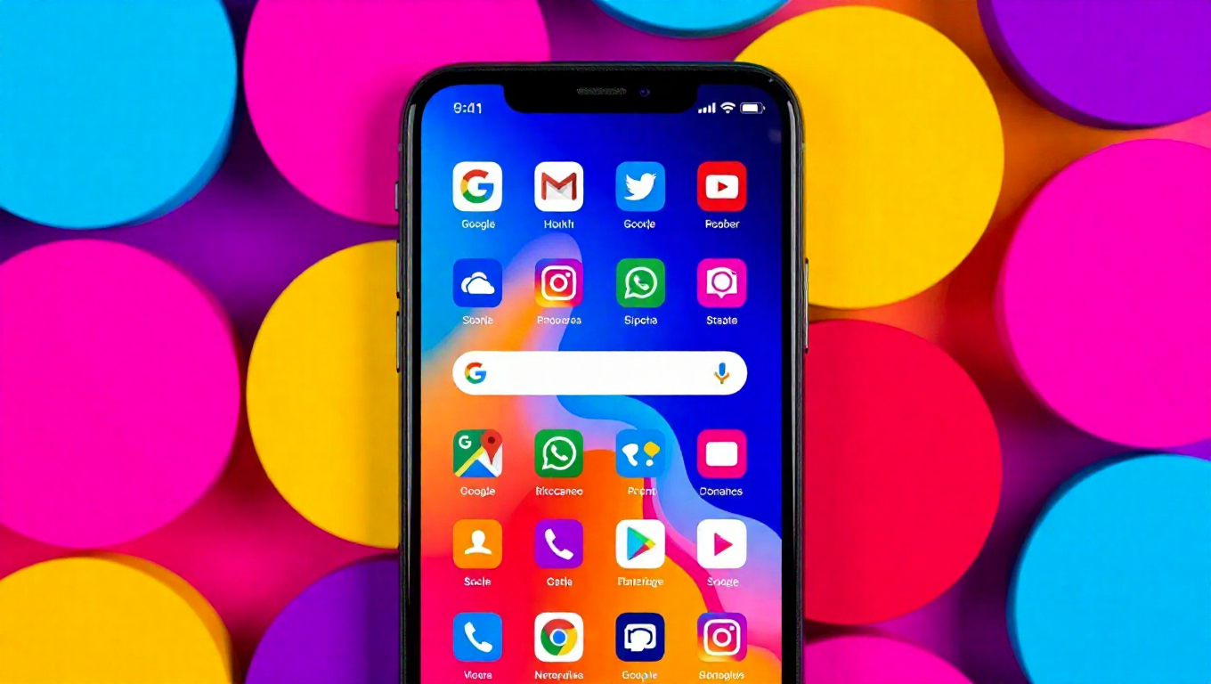
The persistent Google search bar, an integral component of the Pixel launcher, is receiving a significant color overhaul. The update introduces radiant color schemes that dynamically adapt to match device wallpapers, creating a more cohesive visual experience. This represents a continuation of Google's ongoing efforts to refine Android's aesthetic appeal while maintaining functional excellence.
The new color palettes demonstrate improved contrast ratios, making the search widget more legible and easier to interact with across various lighting conditions. This enhancement addresses longstanding concerns about widget visibility, particularly for users with visual impairments or those using devices in bright outdoor environments.
Enhanced Iconography and User Experience
Beyond color improvements, the update includes redesigned icons for microphone, Lens, and AI functionality. These icons appear larger and more distinct, facilitating quicker recognition and interaction. The combination of vibrant colors and enlarged icons creates a more intuitive interface that reduces cognitive load and improves overall usability.
The timing of these visual enhancements coincides with the broader rollout of Android 16's QPR2 stable version, suggesting Google's commitment to continuous interface refinement. These changes build upon previous visual upgrades introduced in earlier updates, demonstrating a consistent approach to interface evolution.
Broader Implications for Widget Ecosystem
The color system improvements in QPR2 could have far-reaching implications for third-party widget developers. The enhanced color palette system provides a foundation for more consistent theming across applications, potentially leading to better integration between system widgets and third-party offerings.
This development suggests Google is prioritizing widget functionality as a key component of the Android experience. The improved contrast and visibility standards established by these changes could influence design patterns across the Android ecosystem, encouraging developers to create more accessible and visually coherent widgets.
Conclusion
Android 16 QPR2's color enhancements represent more than just aesthetic improvements—they signify Google's commitment to creating a more accessible, intuitive, and visually cohesive mobile experience. The improvements to the Google Search widget demonstrate how thoughtful color management can enhance both form and function, potentially setting new standards for widget design across the Android platform. As these changes roll out to users, they promise to make everyday interactions with Pixel devices more pleasant and efficient.